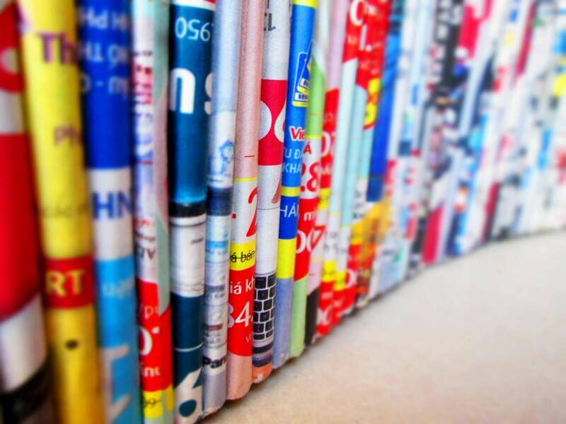
Understanding Color Print Image
A color print image encompasses a visual representation reproduced on physical media through the application of colored inks or toners. It plays a pivotal role in various printing services, ranging from professional photography, marketing materials, art reproductions, to everyday document printing. Unlike black-and-white printing, which involves only shades of gray, color printing yields a full spectrum of hues, enabling more vivid and realistic representations of original digital images.
The significance of color print images lies in their ability to convey detailed information with visual depth and vibrancy. High-quality color images can influence perception, evoke emotional responses, and enhance branding efforts. Whether aiming for accurate photo reproduction or eye-catching promotional materials, a proper color print image requires precise color management and calibration in the printing process.

Understanding the distinction between color and black-and-white printing is fundamental. Black-and-white prints rely solely on varying shades of gray, making them less complex in terms of color management but still requiring attention to contrast and tonal range. Conversely, color printing involves multiple ink layers and complex color mixing algorithms, demanding careful calibration and quality control to ensure the final output matches the original digital image.
Color print images are often produced through specific color management systems that optimize ink usage and color reproduction fidelity. This process ensures that the colors on the printed page align as closely as possible with the digital source, maintaining consistency across different printing sessions and devices. As technology advances, digital printers now offer improved color accuracy, wider color gamuts, and more sophisticated calibration features, allowing for superior image quality in color prints.
When producing a color print image, several factors influence the final result: digital file quality, color profiles, printer capabilities, and paper selection. Proper preparation of the digital image, including cropping, resolution adjustment, and color profile embedding, forms the foundation for successful printing. Additionally, choosing the appropriate paper—glossy, matte, or semi-gloss—can enhance or diminish color vibrancy, impacting the overall visual appeal.
Color print images are utilized extensively in industries such as photography, graphic design, advertising, education, and corporate communications. They serve as a critical component in creating impactful visual content that captures attention and communicates messages effectively. Therefore, mastering the elements involved in the production of color images ensures professional-grade results that meet precise standards and expectations.
Understanding Color Print Image
Creating a vibrant and accurate color print image involves a meticulous process that encompasses various technical and material considerations. The foundation begins with the Digital Image Quality, where high-resolution files ensure sharpness and detail. Properly embedded color profiles—such as Adobe RGB or sRGB—serve as the basis for consistent color rendering across different devices and media. These embedded profiles communicate to the printer how colors in the digital file should be interpreted, replicating the intended hues and saturation levels. When preparing images for printing, it is essential to crop or resize the digital files to match the desired scaled dimensions, as this prevents pixelation and maintains clarity.
Color management systems and calibration tools play a pivotal role in reproducing colors faithfully. These systems analyze the printer, ink, and paper combination to ensure that the output is as close to the digital source as possible. Regular calibration of printers and monitors prevents color drift over time, maintaining the accuracy of color reproduction. When selecting paper, factors like glossiness, surface texture, and thickness influence how light interacts with the printed image, affecting vibrancy and contrast. Glossy papers enhance brightness and color richness, while matte finishes offer a subdued, professional look that reduces glare and fingerprints.
In industries like photography and graphic design, professionals rely on robust color workflows that include precise color profiles, color test prints, and standardized benchmarking. This approach ensures that printed images meet high-quality standards and consistency requirements across multiple print runs. The process often incorporates specialized software capable of simulating how the final print will look, allowing for adjustments prior to the actual printing. Such practices are integral in producing high-fidelity color prints suitable for exhibitions, advertising, books, and other visually demanding applications.
Color Modes in Printing: RGB vs. CMYK
Digital images are primarily created and viewed in the RGB color mode, which corresponds to the color model used by electronic displays such as monitors and cameras. RGB (Red, Green, Blue) enables a broader spectrum of colors, facilitating vivid vivid images suitable for digital consumption. However, print processes utilize the CMYK (Cyan, Magenta, Yellow, Black) color model, which is specifically optimized for ink-based reproduction. The differences between RGB and CMYK are fundamental: RGB can produce a wider palette, while CMYK offers more precise control over ink quantities on physical media. Ensuring that digital files are converted into the appropriate color mode before printing is critical; otherwise, colors may appear washed out or oversaturated in the final print.

This conversion process typically involves soft proofing using color management software, where designers simulate the final printed result on their screens. Correct interpretation of each color mode minimizes discrepancies and guarantees that the printed output aligns with the original visual intent. Proper file handling, including embedding ICC profiles and adhering to print media specifications, further elevates the accuracy of color rendition.
Preparing Digital Images for Color Printing
Preparation begins by choosing high-quality source images, ensuring they are at least 300 DPI (dots per inch) to prevent pixelation. Adjustments in resolution, color balance, and contrast are performed with professional editing tools to optimize vibrancy and detail. Embedding appropriate color profiles guarantees that the printer interprets colors correctly. Cropping and framing the image to fit the output dimensions helps maintain composition integrity, while soft-proofing allows for previewing how colors will translate onto the chosen paper and print process.
Any edits made should preserve color fidelity; over-processing can lead to color shifts, especially when working with highly saturated or subtle pastel shades. Specific attention should be paid to skin tones in portrait images or brand colors in marketing materials, as these require precise accuracy for professional presentation.
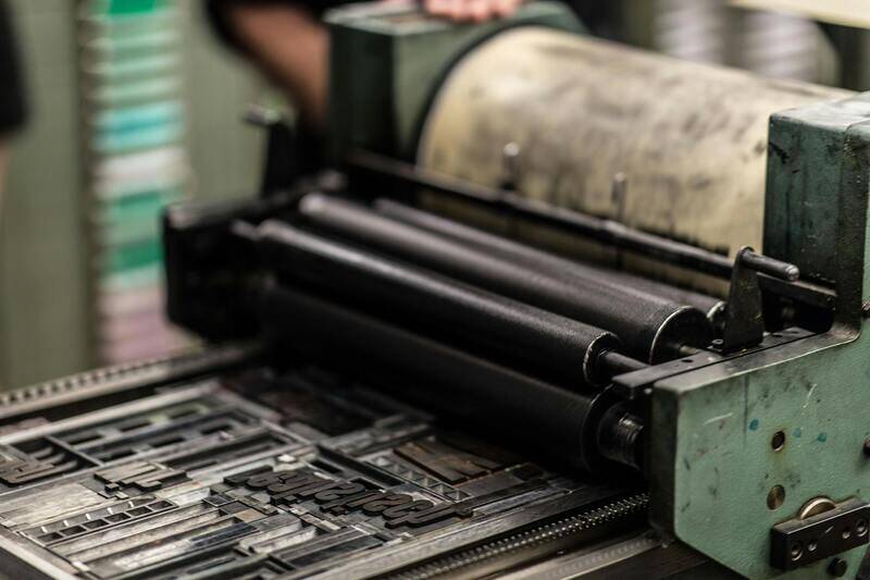
Selecting the Right Printer and Paper
Choosing an appropriate printing device depends on the intended application and desired quality. Inkjet printers, especially those utilizing expanded color inksets, excel at achieving accurate color gradients and rich tonal depth for photographic prints. Laser printers, on the other hand, are often better suited for high-volume commercial printing but may offer less color fidelity in nuanced images.
Paper selection directly impacts the visual outcome. Glossy papers intensify colors, making them vibrant and eye-catching, whereas matte papers provide a softer, more subdued appearance that is suitable for display frames or artistic projects. Semi-gloss or satin finishes strike a balance, offering good vibrancy with reduced glare. Test prints on different papers help determine which surface best complements the digital image's color profile and intended presentation style.
Preparing Digital Images for Optimal Color Output
Achieving vibrant and accurate color reproduction in printed images begins with meticulous preparation of your digital files. This process involves selecting the right color profiles, ensuring sufficient resolution, and applying necessary adjustments prior to printing. Standard color profiles, such as sRGB or Adobe RGB, are essential to communicate the color gamut and tonal range to the printer effectively. For vibrant and true-to-life colors, using an embedded color profile tailored for printing, such as CMYK profiles, ensures consistency between digital display and printed output.
Resolution plays a critical role in print quality. A resolution of at least 300 dots per inch (DPI) is generally recommended for high-quality color print images, as it prevents pixelation and preserves fine details. When preparing digital images, avoid enlarging lower-resolution files, which can lead to pixel distortion and dull colors. Instead, work with the original high-resolution images and resize them carefully, maintaining aspect ratios to prevent distortion.
Further refining your images involves color correction and enhancement. Adjustments to brightness, contrast, and saturation should be made with care to maintain color fidelity. Soft-proofing tools—available in most advanced photo editing software—simulate how images will appear when printed on specific papers and printers. This preview allows you to make targeted adjustments, ensuring that colors translate accurately from screen to print.

It is important to keep original files intact and create copies for editing, preserving the integrity of your master image. Non-destructive editing tools allow you to make adjustments without permanently altering the original file, providing flexibility to fine-tune colors and tonal ranges as needed.
Understanding Color Fidelity and Its Impact on Print Quality
Color fidelity refers to the degree of accuracy with which the printed output matches the original digital image in terms of colors. One of the primary factors affecting color fidelity is the color management workflow. Incorporating color profiles aligned with your printer and paper type ensures that the colors you see on screen closely resemble those in the final print. This process involves embedding compatible color profiles into image files and selecting matching profiles within your print software settings.
To enhance color fidelity, calibrate your monitor regularly, as screens that are out of calibration can mislead you during image editing. Consistent calibration ensures your adjustments reflect true colors, reducing discrepancies when printing. Additionally, printer calibration routines using specialized test prints and color charts can help fine-tune output color accuracy by compensating for individual device variations.
Proper color management minimizes common issues such as color shifts, dull images, or overly saturated prints. It enables professional-quality results, whether for photographic reproductions, marketing materials, or artistic projects. Always perform test prints to verify color accuracy, making incremental adjustments until the desired fidelity is achieved.
Creating Accurate Color Print Images Through Proper Image Preparation
Ensuring vibrant and true-to-original colors in printed images depends heavily on meticulous preparation of the digital file before printing. A foundational step is to convert your images into a suitable color mode, primarily CMYK, which aligns with the printing process. Unlike RGB, which is used for digital screens, CMYK (Cyan, Magenta, Yellow, Key/Black) is optimized for ink-based output, providing a predictable color gamut that closely matches the final printed appearance.
When preparing images for color printing, it is crucial to embed proper color profiles into the files. Color profiles serve as standardized mappings between the color data contained within your image and how the colors are rendered by the printer. Incorporating embedded profiles ensures consistency across various devices and software, helping to avoid unexpected color shifts. This step involves selecting an appropriate color profile compatible with your printer, ink, and paper type, then embedding it during image editing.
Calibration of your monitor cannot be overstated. Accurate color display during editing leads to better predictions of how colors will appear once printed. Regular calibration using professional calibration tools or software guarantees that the screen's output aligns with industry-standard color specifications. This consistency forms the basis for making precise adjustments that will translate well into the printed output.
Beyond calibration and profile management, resizing images to match the desired print dimensions at an appropriate resolution—generally 300 dpi—is essential for sharp, high-quality prints. Lower resolutions can result in pixelation, diluting color vibrancy. Careful cropping and editing to enhance contrast, brightness, and saturation can further improve the print’s color fidelity, provided these adjustments maintain natural hues.
The use of soft proofing techniques allows you to simulate how your digital image will appear when printed on specific media. Many image editing applications support soft proofing, enabling adjustments in real-time before committing to ink. This step is invaluable for correcting colors that may appear oversaturated, dull, or off-tone after the soft proof, ultimately ensuring that the printed image matches your expectations.
Finally, performing test prints with color charts or test images helps verify that your adjustments and calibration are effective. These test runs allow you to make incremental modifications, such as tweaking color saturation or gamma settings, for achieving the most accurate and vibrant print results. Implementing a rigorous approach to image preparation—covering color mode conversion, profiling, calibration, resizing, soft proofing, and test printing—directly contributes to creating color print images that stand out with clarity, richness, and true-to-life hues.
Understanding Color Print Image
Creating a stunning color print image involves more than just selecting a vibrant digital picture. It encompasses a comprehensive understanding of color fidelity, proper image preparation, and careful execution of printing techniques. A color print image is essentially a digital file that captures the nuances of hues, shading, and contrasts, which need to be accurately transferred onto physical media. To achieve a high-quality output, it is vital to ensure that your digital file is optimized for printing, considering factors such as color mode, resolution, and color management setups. Proper preparation not only guarantees that the printed image reflects your creative intent but also enhances its visual impact, especially when displayed or presented professionally. The process begins at the digital level but requires diligent attention throughout to preserve vibrancy, depth, and accuracy of colors in the physical print.

Color Modes in Printing: RGB vs. CMYK
Understanding the distinction between RGB and CMYK color modes is fundamental when preparing images for printing. RGB (Red, Green, Blue) is the standard color mode used for digital displays, such as monitors and cameras. It leverages light to produce vibrant colors, offering a broad gamut that can encompass more vivid shades. However, not all RGB colors are reproducible in print, since printers traditionally operate within the CMYK (Cyan, Magenta, Yellow, Black) color space, which relies on subtractive color mixing. CMYK offers a narrower gamut but ensures that colors are consistent when printed. Converting images from RGB to CMYK before printing is considered best practice, as it allows for calibration and adjustments tailored specifically for your printer’s capabilities. Proper conversion minimizes surprises like dull or oversaturated colors, ensuring the final print aligns with your original vision.
Preparing Digital Images for Color Printing
Effective preparation of digital images is critical for achieving vibrant, true-to-life color prints. The process encompasses several steps: first, verify that your image's resolution is at least 300 dpi to guarantee sharpness and detail. Resize your image appropriately to match the desired print dimensions without stretching or compressing it, which can distort colors and shapes. Next, perform color mode conversion from RGB to CMYK within your editing software, ensuring that color profiles are embedded for accurate reproduction. Editing adjustments, such as enhancing contrast, brightness, and saturation, should be made carefully to preserve natural hues, avoiding overly artificial effects. Soft proofing—simulating how your image will appear when printed—serves as an essential tool for previewing colors and making necessary corrections beforehand. Conducting test prints with color calibration charts allows for fine-tuning the printer’s settings, toner or ink levels, and paper type, ultimately securing consistency and vibrancy across prints.
Selecting the Right Printer and Paper
The decision of printer and paper directly influences the accuracy and vibrancy of your color print image. Professional-grade inkjet printers offer precise color management systems and broader color gamuts, which are essential for producing true-to-life hues and intricate details. When choosing a printer, evaluate its color reproduction capabilities, ink stability, and compatibility with various media. Equally important is selecting the appropriate paper type; glossy, semi-gloss, matte, or luster finishes all have different effects on color vibrancy and texture. Glossy papers tend to amplify color brightness and contrast, providing vivid, sharp images, whereas matte surfaces offer a softer, more subdued finish that can also help reduce glare. The weight and coating of the paper can affect ink absorption and longevity, so match your paper choice to your printer specifications and the intended presentation of the print. Proper pairing of printer and paper ensures that your color print image maintains its vibrancy, detail, and durability over time.
Evaluating the Quality of Your Color Print Image
Once your printing process is complete, assessing the quality of your color print image is a critical step. This evaluation ensures that the output matches your expectations in terms of color accuracy, detail, and overall vibrancy. To make an accurate assessment, consider several key aspects:
- Color Fidelity: Verify that the printed colors closely resemble the digital image. This involves checking for any unwanted color shifts or dullness that may indicate calibration issues or incompatible ink and paper combinations.
- Color Vibrancy: Bright, lively colors make your image stand out. If the colors appear muted or washed out, it could be a sign to revisit your printer settings or choose a different paper type that enhances color saturation.
- Detail and Sharpness: Examine your print under good lighting. Fine details, edges, and textures should be crisp, especially in high-resolution images. Blurriness or lack of definition suggests a need for adjusting print resolution or cleaning print heads.
- Color Gradients and Transitions: Smooth gradients without banding or abrupt color changes reflect proper color management and high-quality printing. Uneven transitions may require test print adjustments or further calibration.
Applying objective criteria during this review process helps detect potential problems early. Frequent evaluations using standard color test images can identify discrepancies in color reproduction, enabling targeted troubleshooting. Also, utilizing calibration tools, such as color management software or calibration charts, supports maintaining consistency over multiple prints.

In cases where the printed image does not meet your standards, adjustments can be made by revisiting your printer settings, updating color profiles, or experimenting with different paper types. Regular quality checks ensure that your color print images consistently achieve the desired visual impact, setting the foundation for professional, high-quality results every time.
Ensuring Accurate Color Reproduction Through Calibration and Color Management
Achieving consistent and vibrant color print images begins with proper calibration and effective color management protocols. Calibration involves adjusting your printer, monitor, and workflow to ensure that the colors intended in your digital files match the printed output. This process minimizes discrepancies caused by hardware inconsistencies, ambient lighting conditions, or outdated color profiles.
Utilizing professional calibration tools, such as hardware colorimeters and color management software, allows precise adjustments of both displays and printers. By creating custom profiles for your specific printer and paper combination, you ensure that all colors are accurately translated from digital images to physical prints. These profiles serve as a guide for interpreting color data correctly, preventing issues such as dullness, oversaturation, or color shifts.
Consistent application of calibration routines, coupled with adherence to color management best practices, reduces the need for repeated test prints, saving both time and resources. In contexts where high fidelity is critical, such as professional photography, fine art printing, or branding, investing in robust calibration methods ensures that printed images reflect the artist's or client's vision with precision.
Moreover, understanding and controlling ambient lighting conditions in your workspace is essential. Using neutral, color-balanced lighting minimizes the influence of external light sources on your visual assessment of prints. Regularly reviewing color test prints, adjusting profiles as necessary, and maintaining your equipment helps sustain high standards of color accuracy across multiple print jobs.
Advanced Techniques for Color Optimization
- Soft Proofing: Utilize software that simulates how your colors will appear on specific papers or devices, allowing pre-emptive adjustments.
- Gamut Mapping: Address out-of-gamut colors by selectively adjusting hues, ensuring the most vivid and accurate output possible.
- Regular Maintenance: Clean print heads, update firmware, and replace ink cartridges as needed to sustain optimal color performance.
By integrating these techniques into your workflow, you enhance your ability to produce color print images that are both visually striking and true to their digital origin, elevating the overall quality and professionalism of your printed materials.
Ensuring Accurate Color Print Images Through Proper Calibration and Color Management
Achieving consistent and vibrant color print images begins well before pressing the print button. It requires a comprehensive understanding of calibration procedures and effective color management strategies that ensure your digital files translate accurately from screen to print. Implementing these methods not only enhances visual fidelity but also streamlines your workflow, saving time and resources in the process.
Calibration of Monitors and Printing Devices
Accurate color reproduction starts with calibrating your monitor. This process adjusts your display settings to produce colors that align with industry standards, providing a reliable reference point for editing your images. Use professional calibration tools, such as hardware calibrators, which analyze your screen’s output and create custom ICC (International Color Consortium) profiles tailored specifically to your device. Regular calibration, ideally monthly, maintains the fidelity of your monitor, especially if ambient lighting conditions change frequently.

Parallel to monitor calibration, your printer should also be calibrated through specialized hardware or software solutions. Printer calibration involves printing a color test chart and analyzing it with a spectrophotometer or colorimeter. The device measures the output, enabling the creation of a custom ICC profile for your specific printer and paper combination. This profile ensures the printer reproduces colors with high accuracy, minimizing discrepancies between digital files and printed output.
Utilizing Color Management Workflows
A disciplined color management workflow involves embedding ICC profiles within your images and ensuring consistent use across all stages of the printing process. Workflow best practices include:
- Designing in a color-managed environment, utilizing software that supports ICC profiles.
- Assigning the correct color profiles to your digital images prior to printing.
- Specifying the correct printer and paper profiles within your print driver settings.
- Choosing the appropriate rendering intent—either perceptual or relative colorimetric—based on image content and desired output.
Advanced Color Optimization Techniques
Beyond basic calibration, advanced techniques can enhance the vibrancy and accuracy of your color print images. Soft proofing allows you to preview how an image will appear when printed, adjusting hues and saturation accordingly in your editing software. Gamut mapping techniques address out-of-gamut colors by either compressing hues within printable ranges or selectively adjusting affected regions to preserve perceptual quality.
Regularly reviewing and adjusting these settings ensures your workflow adapts to varying paper types and ink formulations, ultimately delivering print images that meet professional standards of color fidelity.
Implementing Best Practices for Consistent Results
Consistent, high-quality color printing hinges on routine maintenance and strict adherence to calibration protocols. Properly cleaning print heads, updating firmware, and replacing inks when needed prevent color inaccuracies caused by equipment malfunction or degradation. Documenting calibration settings and color profiles used in each project facilitates reproducibility and quality control across multiple print runs.
In environments where color accuracy is paramount, investing in professional-grade calibration tools and software, coupled with a controlled lighting setup, significantly improves your ability to produce and evaluate true-to-source printed images. Through adherence to these official and reliable methods, you can confidently generate color print images that reflect your digital artistry with precision.