Understanding Colour Brochure Printing
In the realm of marketing and brand promotion, colour brochure printing stands out as a vital tool for conveying information with visual appeal and professional finesse. This process involves creating multi-page printed materials that utilize vibrant, full-colour imagery and text to capture attention, communicate key messages, and reinforce brand identity. Unlike monochrome or limited-colour prints, colour brochures leverage a broad spectrum of hues, allowing businesses to design eye-catching layouts that resonate with target audiences.
The significance of colour brochure printing in contemporary marketing strategies cannot be overstated. It offers a tangible, visually compelling method to showcase products, services, or corporate values. Through precise colour reproduction, companies can evoke particular emotions, enhance brand recognition, and differentiate themselves from competitors.
One of the foremost advantages of employing vibrant, full-colour designs is their ability to attract attention swiftly. When potential clients receive a brochure with bright imagery, contrasting colours, and engaging graphics, they are more likely to engage with the content. The use of colour not only makes the brochure more aesthetically appealing but also aids in organizing information effectively, guiding the reader's eye through various sections.
Moreover, advanced colour brochure printing ensures high-fidelity reproduction of images and graphics. Modern printing techniques utilize sophisticated colour management systems that accurately translate digital designs into printed materials, maintaining consistency and vibrancy across batches. This precision is crucial for branding integrity, especially for companies that rely on exact colour matches for logos, brand colours, or product packaging.
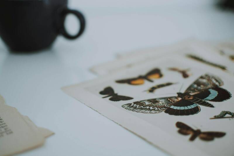
Using colour brochures also offers versatility in design. They can incorporate various elements such as photographs, infographics, charts, and illustrations to communicate messages clearly and memorably. The interplay of colours and images can simplify complex information, making it more digestible for the target audience.
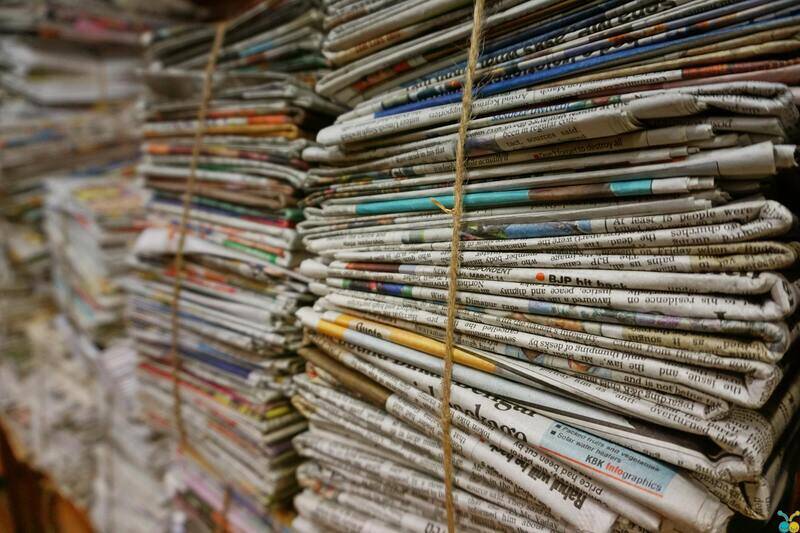
From a practical perspective, colour brochure printing services often provide a range of options to suit different business needs. These range from small runs suitable for local events to large-volume productions for extensive marketing campaigns. The choice of paper quality, finishing effects, and binding options further enhances the final product's professional appearance.
To maximize the impact of a colour brochure, understanding its fundamental components is essential. These include layout design, colour schemes, typography, and imagery—all harmonized to create a cohesive, compelling message. When designed thoughtfully, brochures serve as powerful marketing collateral capable of leaving lasting impressions.
Overall, colour brochure printing remains a cornerstone of effective marketing communication. Its ability to produce vibrant, attention-grabbing materials supports diverse promotional goals, from product launches to corporate presentations. High-quality printing ensures that every colour detail is accurately rendered, maintaining the integrity of the original design and conveying professionalism to prospective clients. When executed correctly, colour brochures serve not only as informative tools but also as influential brand ambassadors that elevate a company's market presence with elegance and visual appeal.
Understanding Colour Brochure Printing
Colour brochure printing hinges on meticulous attention to detail, ensuring that the final product not only captures the essence of the brand but also communicates the intended message with clarity and vibrancy. The process begins with selecting the appropriate printing technology, which directly influences colour accuracy, resolution, and overall quality. Digital and offset printing are the two primary methods used, each offering distinct advantages depending on the volume and complexity of the project.
Printing Technologies and Their Impact
Offset printing stands out for its ability to produce consistent, high-resolution images ideal for large runs. It offers precise colour reproduction that faithfully renders intricate design details, making it suitable for premium brochures that demand a professional finish. Digital printing, on the other hand, provides flexibility for smaller quantities and quick turnaround times without compromising on colour brilliance, making it a preferred choice for localized campaigns or prototypes.
Colour Management and Calibration
A vital component of colour brochure printing is colour management. This involves calibrating printers and monitors to ensure colour consistency across different batches. Employing colour profiles and standardised workflows, printers can match colours accurately, preserving the integrity of the original design. Using high-quality inks and substrates further enhances this process, resulting in brochures that display rich, true-to-life colours.
Material Selection for Optimal Visual Appeal
The choice of paper plays a critical role in the overall look and feel of the brochure. Glossy papers accentuate colours and add vibrancy, ideal for image-heavy designs and product showcases. Matte finishes lend a sophisticated touch and reduce glare, facilitating easier reading of detailed information. Other options like silk or satin provide a balanced sheen that offers elegance without reflection. The weight of the paper, often between 130gsm and 170gsm, impacts durability and perceived quality, aligning with brand positioning.
Finishing Techniques and Their Role
To further elevate the visual impact, various finishing options can be applied. UV coating adds a glossy protective layer that enhances colours and provides resistance against scratches. Matte varnishing offers a muted, elegant finish with excellent tactile qualities. Spot UV coats can be selectively applied to highlight specific areas, such as logos or key messages, drawing attention in a subtle yet effective manner. Additionally, embossing or foil stamping are luxurious touches that add texture and shimmer, making the brochure stand out even more.
Color Modes and Resolution Standards
Ensuring the accuracy and clarity of colours begins with proper use of color modes. For print purposes, the CMYK color model is standard, allowing for precise colour mixing suitable for vibrant brochures. Resolution standards typically recommend a minimum of 300 DPI to guarantee sharp, detailed images and crisp text. Adhering to these technical specifications minimizes print defects and ensures the final product meets professional expectations.
Maintaining Consistency and Quality Control
In large-scale projects, consistency across all copies is essential. Pre-press proofing processes enable clients to review colour fidelity before the full run, reducing the risk of discrepancies. Random quality checks during printing help identify potential issues early, allowing for adjustments that keep the output uniform. Choosing reputable printing vendors equipped with advanced calibration tools ensures that the final brochures consistently reflect the intended design and branding standards.
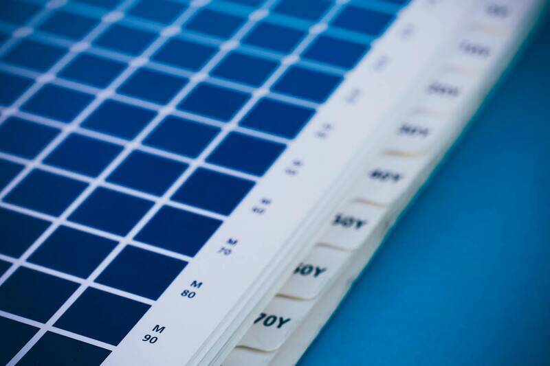
Standard and Custom Colour Matching Methods
Achieving consistent and precise colours in brochure printing relies on standardized colour matching techniques. The most widely used method is the Pantone Matching System (PMS), which assigns unique codes to specific colours, ensuring accurate reproduction across different print runs and media. When designed with PMS colours, your brochures can feature brand-specific hues that remain consistent, regardless of printing location or batch. This is especially beneficial for companies requiring strict brand colour adherence.
Another critical aspect of colour accuracy is the use of swatch books and colour calibration tools. Designers often refer to physical colour samples to select exact shades, minimizing discrepancies during digital design processes. Reputable printing facilities employ spectrophotometers and colour management software to calibrate equipment regularly. These tools facilitate the precise translation of digital designs into physical prints, aligning the colours closely with your original vision.
Impact of Paper and Finish on Colour Rendering
The choice of paper stock plays a pivotal role in how colours appear in printed brochures. Glossy paper, such as high-gloss art paper, enhances colour vibrancy and contrast, making images pop and retaining sharpness. Matte finishes, however, tend to soften colours, providing a subdued, sophisticated look that minimizes glare and fingerprints. Selecting the appropriate paper depends on your brand identity and the message you wish to convey.
Beyond paper, finishing techniques like varnishing, lamination, or coating can significantly influence colour perception. For instance, a gloss varnish amplifies colours, boosting brightness and creating a striking visual effect. Conversely, matte coatings can tone down images for a more elegant feel. These finishes also provide protective layers, preserving the vibrancy of colours over time and maintaining the brochure's professional appearance.
Techniques for Effective Colour Incorporation in Brochure Design
- High-Resolution Imagery: Use images with a resolution of at least 300 DPI to ensure colour detail and sharpness. Low-resolution images can result in dull, pixelated prints that misrepresent the intended colours.
- Consistent Colour Palette: Develop a cohesive colour scheme aligned with your brand. Limit the palette to a few harmonious colours to maintain visual consistency and avoid distracting the reader.
- Layering and Contrast: Utilize colour layering and contrast techniques to highlight key messages or products. Strategic use of colour can direct the reader’s eye to important information.
- Design for Context: Consider how colours will appear in different lighting environments and on various paper stocks. Testing prints with samples can prevent unexpected outcomes.
By deploying these strategies, your brochure can achieve maximum visual impact, effectively communicating your message while reinforcing your brand identity.
Material Choices and Printing Techniques for Colour Brochure Printing
Choosing the appropriate materials and printing techniques is essential to achieving vibrant, durable colour brochures that effectively communicate your brand message. The selection of paper stock influences not only the visual impact but also the tactile experience of the final product. High-quality options such as gloss art paper are popular for their ability to enhance colour intensity and sharpness, making images pop with clarity. Matte finishes provide a sophisticated, understated look, reducing glare and creating a smooth surface that complements detailed designs.
Recycled paper stocks offer an eco-friendly alternative, maintaining colour vibrancy while promoting sustainability. Finishing touches like lamination and UV coating provide added protection, preserving colour vibrancy against environmental factors and handling wear. Lamination offers a glossy or matte layer, further intensifying colours and adding a professional sheen, while UV coating can be selectively applied to highlight specific areas, creating contrast and drawing attention.
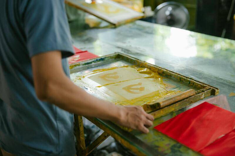
Printing techniques play a critical role in colour reproduction. Offset printing, renowned for its precision and consistency, is ideal for projects demanding high-volume production with consistent colour accuracy across batches. Digital printing, on the other hand, offers flexibility for short runs or customized brochures, producing vivid colours with quick turnaround times. Both methods support various finishing options, allowing for a tailored approach based on project needs.
To maximize colour impact, printers may utilize advanced colour management systems, such as the CMYK process, which accurately reproduces full-spectrum colours. Techniques like layering, masking, and spot colours can further enhance specific hues or create special visual effects. When combined, material choices and specialised printing methods ensure your brochures stand out with bright, consistent, and professional-quality colours that effectively promote your brand and message.
Understanding Colour Brochure Printing
Colour brochure printing is a cornerstone of effective visual communication, offering a versatile platform to showcase products, services, or brand stories with vibrant clarity. High-quality colour reproduction is essential to capture attention and convey professionalism. To achieve this, professional printing processes rely on advanced colour management systems, accurate colour matching, and high-resolution image quality. The goal is to produce brochures that not only look appealing but also accurately represent the brand’s identity, ensuring consistent colour output across different print runs.
Official methods for colour brochure printing involve a combination of industry-standard techniques, such as offset printing and high-end digital printing, each suited to specific project requirements. Offset printing, renowned for its precision and efficiency in large-volume production, employs a well-calibrated process that ensures colour consistency and sharp detail. Digital printing offers flexibility for short runs and customisation, delivering vivid colours with rapid turnaround times. These methods integrate sophisticated calibration processes, including colour separation and colour profiling, to guarantee that colours reproduced on paper precisely match the intended design.
Color Management and Quality Assurance
Essential to professional brochure printing is the implementation of rigorous quality control measures. This includes verifying that artwork files conform to industry standards, such as using the CMYK colour mode rather than RGB, which is optimized for screen display. CMYK aligns with the printing process, ensuring colours are accurately reproduced on physical media. Maintaining a resolution of at least 300 DPI ensures sharp, detailed images free from pixelation, regardless of the brochure size or layout complexity.
Print providers often employ advanced colour matching tools, such as spectrophotometers, to calibrate equipment and verify colour output throughout the production process. Colour layering, spot colours, and varnishes may also be used to highlight key areas or create special visual effects that enhance the overall aesthetic appeal of the brochure. These professional methods ensure consistent and vibrant colour reproduction that effectively communicates your brand message and leaves a lasting impression.
Understanding Colour Brochure Printing
Colour brochure printing is an essential aspect of creating visually impactful marketing materials that effectively communicate a brand's message. It involves the precise reproduction of colours, high-resolution imaging, and the application of various printing techniques to produce vibrant and professional-looking brochures. Utilising colour brochure printing services that adhere to industry standards ensures that the final product maintains consistency in colour fidelity across different batches and substrates. This process is critical for maintaining brand integrity and capturing the attention of potential clients or customers.
Key Components in Colour Brochure Printing
- Colour Accuracy: Achieved through meticulous colour management techniques, including calibration of printing equipment and colour profiling, to reproduce the hues of your design precisely.
- Resolution Standards: Maintaining at least 300 DPI creates sharp, detailed images that remain clear across various brochure sizes and formats.
- Colour Mode Selection: Using the CMYK colour mode rather than RGB optimises colour accuracy during the printing process.
- Special Effects: Spot colours, varnishes, and layering techniques can be employed to enhance visual appeal and highlight key areas within the brochure.
Colour Management and Quality Assurance Methods
Implementing rigorous quality controls is vital to achieving consistent colour output. This includes using spectrophotometers to calibrate printers, verify colour reproduction at various production stages, and ensure adherence to colour profiles. Such precision guarantees that the printed colours match the intended design, whether it involves subtle gradients or vibrant contrasts. Additionally, pre-press checks for image resolution and file compatibility reduce the risk of defects or colour shifts during production.
Enhancing Brochures with Special Finishes
- Varnishes and Spot Glosses: Add a glossy or matte finish to specific elements of the brochure to create visual interest and tactile differentiation.
- Layering Techniques: Use multiple colour layers or spot colours to intensify hues and improve colour richness without sacrificing clarity.
- Mixed Media: Combining matte and gloss finishes enhances contrast, making images and text more striking.
Leveraging these professional enhancements, combined with precise colour management, results in brochures that not only look stunning but also effectively communicate the intended message and brand identity.
Understanding Colour Brochure Printing
Colour brochure printing is a sophisticated process that transforms digital design files into vibrant, eye-catching printed materials. It involves precise control over colour reproduction, material selection, and printing techniques to ensure that the final product accurately reflects the intended visual identity. High-quality brochure printing employs a combination of advanced equipment, colour management protocols, and expert oversight to produce consistent, sharp, and appealing printed brochures that effectively communicate brand messages and entice potential customers.
The process begins with digital proofs or mock-ups that serve as a standard for colour accuracy. These proofs are calibrated using specialized colour management software and hardware, such as spectrophotometers, to maintain colour fidelity across different print runs. The choice of paper stock and finishing techniques also significantly influences colour vibrancy, contributing to the overall aesthetic appeal. Managed colour workflows ensure that the printed output aligns perfectly with the original design, rendering subtle gradients, bold contrasts, and intricate details with clarity and consistency.
Methods Used to Achieve Precise Colour Reproduction
- Use of Standard Colour Modes: Most brochures employ CMYK (Cyan, Magenta, Yellow, Black) colour mode to recreate a wide spectrum of colours. This mode allows for a balanced, reproducible palette that provides consistency across different printing devices and substrates.
- Implementation of ICC Profiles: International Color Consortium (ICC) profiles are embedded within digital files to specify colour parameters tailored to specific paper types, inks, and printing conditions, thereby standardizing output quality.
- Advanced Calibration Techniques: Regular calibration of printers ensures that colours don’t shift over time. This includes routine checks with spectrophotometers and the application of precise calibration curves to maintain colour accuracy throughout every batch.
- Proofing and Soft Proofing: Digital proofs and colour simulations on calibrated screens help verify design accuracy before printing, reducing errors and costly reprints.
- Professional Printing Equipment and Ink Technology: High-end digital presses and offset printing machines provide a broader colour gamut and better control, especially in reproducing vibrant hues and subtle shades.
Ensuring High-Resolution and Sharp Details
In addition to accurate colour management, resolution standards are critical for sharp, detailed brochure images. Industry benchmarks recommend a minimum of 300 dots per inch (dpi) for images and graphics to ensure clarity and crispness in the final print. Maintaining these standards during file preparation minimizes pixelation and blurriness, particularly in high-contrast areas and fine text. Vector graphics and high-resolution photos should be used exclusively to prevent degradation in quality. Pre-press checks for image resolution and file compatibility are essential steps to avoid errors that may compromise visual fidelity or colour accuracy during production.
Additional Techniques for Enhancing Brochure Appeal
- Spot Colours and Special Inks: Using spot colours can create vibrant accents or brand-specific shades that cannot be reproduced with standard CMYK inks. Metallic or fluorescent inks can add a distinctive tactile or visual element to key brochure elements.
- Varnishes and Coatings: Applying gloss, matte, or satin varnishes over specific areas enhances contrast and adds textural variation, making important sections stand out while providing durability and resistance to wear.
- Layering and Overprinting: Multiple colour layers or subtle overprinting effects deepen colour richness and add sophistication to the design, especially in backgrounds and gradients.
- Special Finishes: Embossing, debossing, and spot UV coatings create tactile accents that draw attention and reinforce branding efforts.
When executed with precision, these advanced colour management and finishing methods lead to brochures that not only visually impress but also uphold the client's brand integrity. This rigorous approach ensures that every detail, from colour consistency to image sharpness, aligns with high professional standards, making the final printed piece a powerful communication tool.
Understanding Colour Brochure Printing
Colour brochure printing stands as a cornerstone in contemporary marketing, aligning vibrant visuals with compelling content to capture the audience's attention effectively. The process demands meticulous attention to detail, ensuring that colours are reproduced accurately across various printing methods and materials. At the core of this process is an understanding of colour management systems and the technological nuances involved in translating digital designs into tangible prints. Accurate colour reproduction not only enhances brand recognition but also ensures consistency across multiple print runs, reinforcing professional image and trustworthiness in the eyes of consumers.
Ensuring Colour Consistency and Accuracy
Achieving consistent colour output requires adherence to standardized colour modes, primarily CMYK, which is the industry standard for print. Designers must prepare artwork files with precise specifications, including proper colour profiles and resolutions, to facilitate smooth translation from digital to print. Regular calibration of printers, coupled with comprehensive pre-press checks, ensures that the colours on the final brochure match the original design intent. This consistency is vital for brand integrity, especially when colour-specific branding elements or logos are involved.
Techniques for High-Quality Colour Reproduction
- Colour Proofing: Prior to full production, colour proofs allow clients to verify colour accuracy and make necessary adjustments, reducing the risk of discrepancies in the final product.
- Use of High-Quality Inks: Specialist inks, including spot colours and specialty inks such as metallic or fluorescent, provide vibrant accents that standard CMYK processes may not achieve alone.
- Advanced Printing Technologies: Digital and lithographic printing techniques equipped with high-resolution capabilities and colour management systems support detailed colour reproduction for intricate designs and gradients.
Colour Finishing Touches for Impact
Beyond basic colour reproduction, finishing techniques can augment the visual appeal and tactile quality of brochures. Spot UV coatings, embossing, and foil stamping not only add aesthetic value but also enhance colour vibrancy and depth. Selecting the appropriate finishing methods depends on the brochure's purpose, target audience, and overall branding strategy. These enhancements ensure that each brochure delivers a memorable impression, effectively communicating the intended message with clarity and elegance.
Working with Experienced Printers for Optimal Results
The expertise of a professional printing service is crucial to translating colour designs with precision. Experienced printers employ rigorous quality controls, sophisticated colour management tools, and the latest technical innovations to deliver high-fidelity prints. Clear communication between clients and printers, including detailed specifications and sample approvals, is fundamental to achieving the desired outcome. Moreover, selecting a provider with a proven track record in colour brochure printing ensures reliability, quality consistency, and complete satisfaction with the final product.